Plant life
A drawing/watercolour of orchids at RHS Wisley. This was quite a fiddly one. Fun to draw, especially the twisting turning leaves, bulbs, and intricate flowers. The colour was more tricky, building up quite a… Continue reading
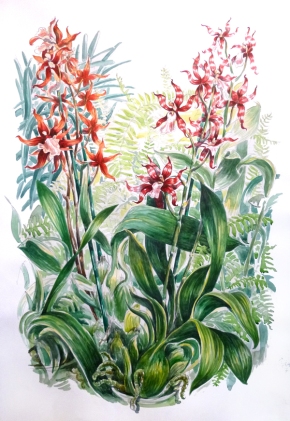
A drawing/watercolour of orchids at RHS Wisley. This was quite a fiddly one. Fun to draw, especially the twisting turning leaves, bulbs, and intricate flowers. The colour was more tricky, building up quite a… Continue reading
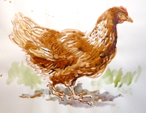
I’ve been in the mood for feathers. Here is an ink drawing I made a while ago of a chicken, and below some pencil sketches of Merlin, a characterful raven at the Tower… Continue reading
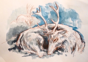
A collection of deer drawn from life in Bushy Park. Most of these were done in the Easter holiday/ May half term. The park deer are very tame so I find I can… Continue reading
I will be taking part in the Richmond upon Thames annual ART HOUSE Open Studios, open for visits on the weekends of 25th-26th June and 2-3rd July, from 11am-6pm. You can find further… Continue reading
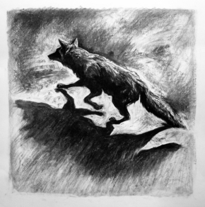
My jogging routine is, ahem, not worthy of being called a routine. However when the stars do align and I get out of the door on a dark night it is nearly always… Continue reading
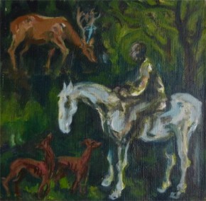
My recent visit to Richmond Park I was reminded of the painting of The Vision of St Eustace by Pisanello in the National Gallery, which I drew some while ago. I bought a… Continue reading
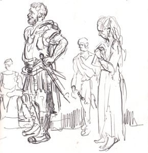
Some sketches made from the yard of the Globe Theatre yesterday. Warning: Spoiler Alert! This production of Titus Andronicus has got a lot of press for live blood and gore, so this fits in… Continue reading
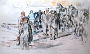
I really enjoyed seeing the George Bellows exhibition at the Royal Academy last year. I’ve always enjoyed but never quite been driven by Edward Hopper, Bellow’s more famous contemporary American artist. But discovering Bellows… Continue reading
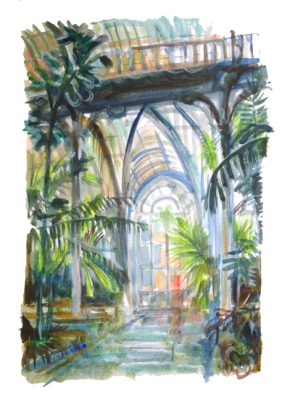
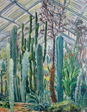
I’m really enjoying being back in the suburbs and re-visiting old haunts. And so to Kew Gardens again, I made several drawings of it years ago when I was mainly working in pen.… Continue reading
After a lot of time teaching and not much time drawing and painting, it’s been good to get the brushes out and do some painting from observation at Kew Gardens. This was supposed to… Continue reading